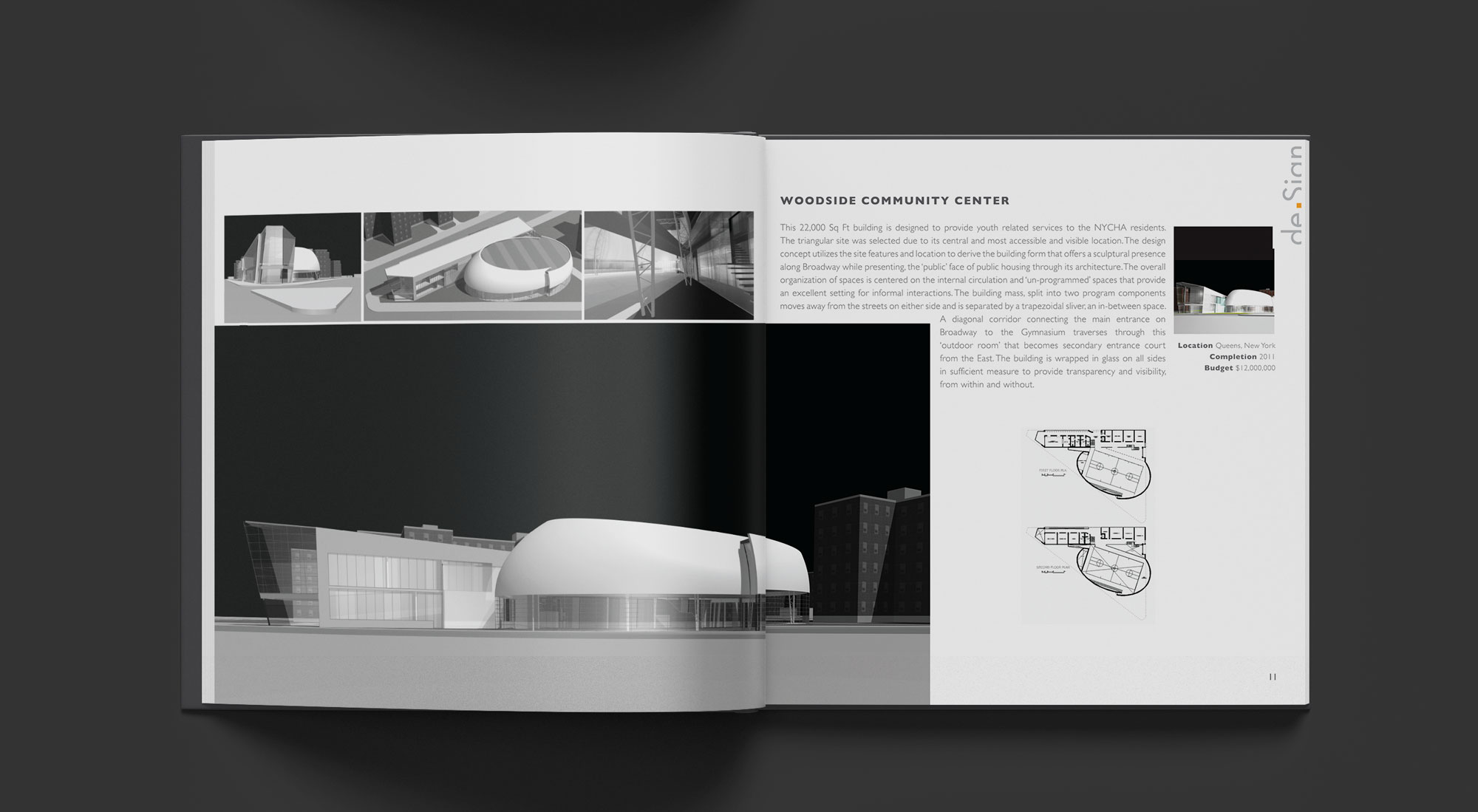
-
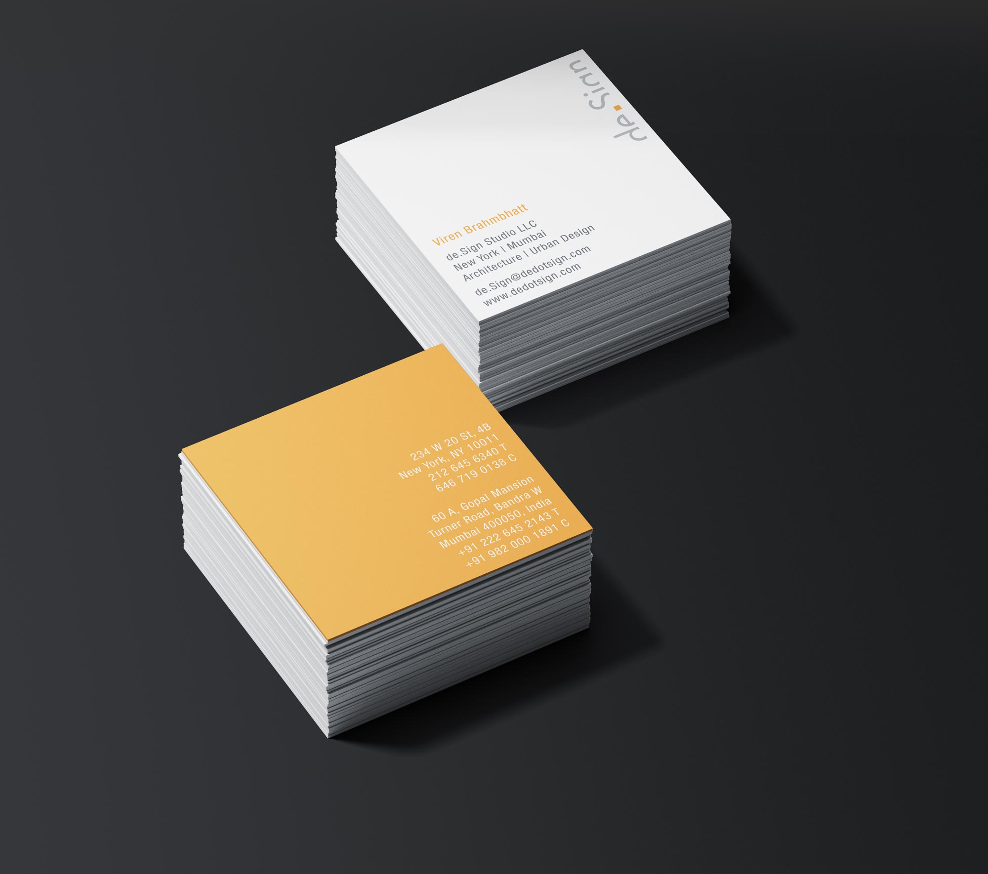
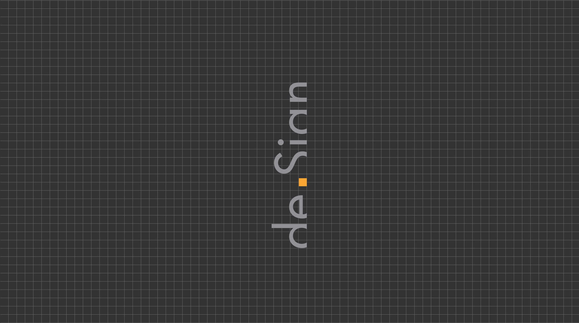
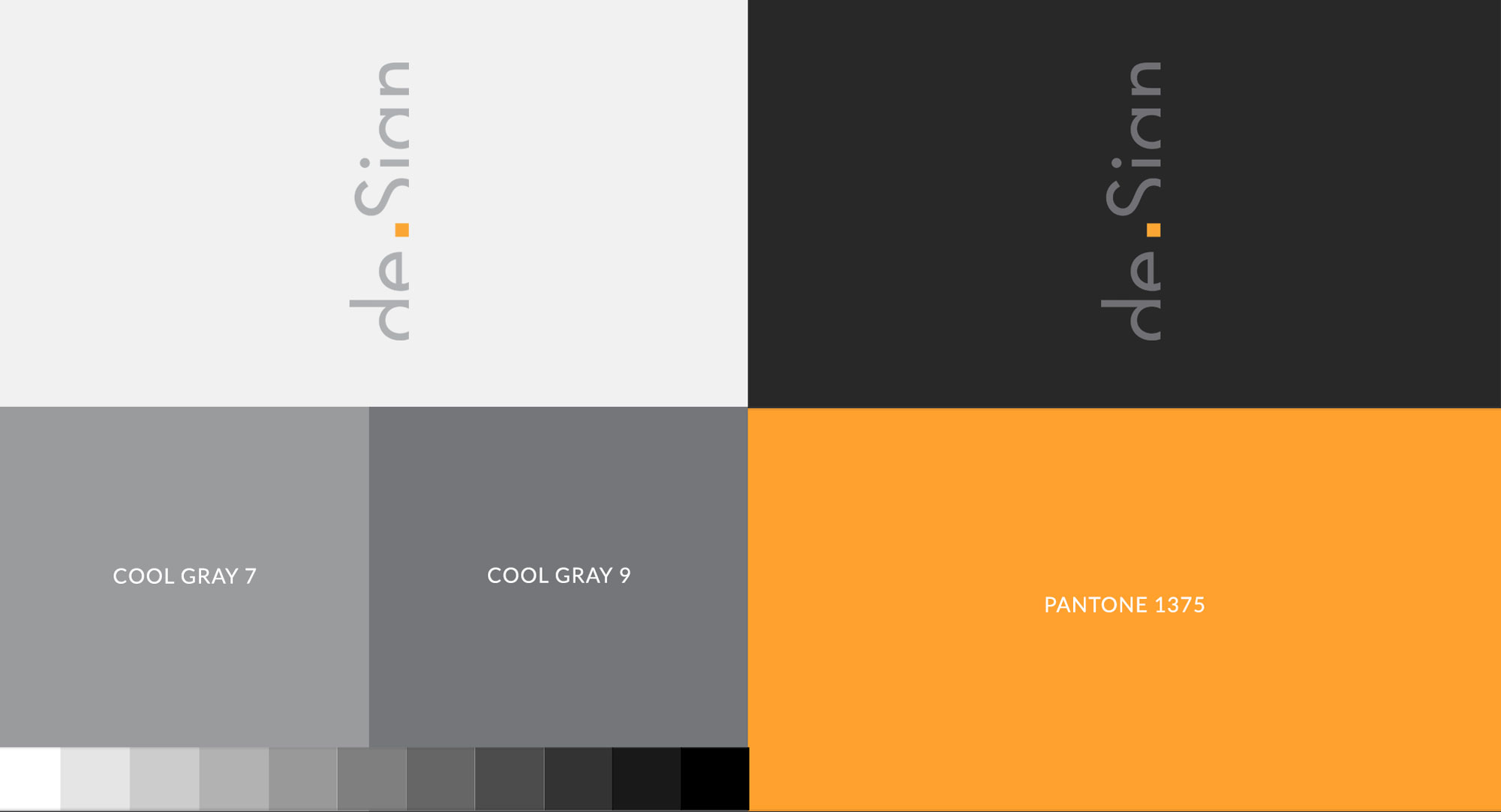
BRANDING
Brand Strategy for this project draws from de.Sign Studio’s vision and philosophy for innovative design focused on sustainability for developing new hybrids and paradigms.
deSign itself is a 'derived’ name, so the approach was to ‘construct’ the Logo by decoding the many diverse meanings of the word ‘design’. The logo is derived from the visual pairing or conjoining of de and Sign with the help of Orange Square to create a visual word. The square symbol represents structure, balance, logic, stability and order; it also denotes space in architecture. Orange Square is consistently used for various visual elements of company’s brand identity.