
-
BRANDING
The Brand Strategy combines SNS Developers LLP’s new vision and corporate philosophy for excellence through good design, construction, innovative technology and sustainability to reposition the company with the intention of developing a new, differentiated identity in the minds of buyers, investors, and competitors.
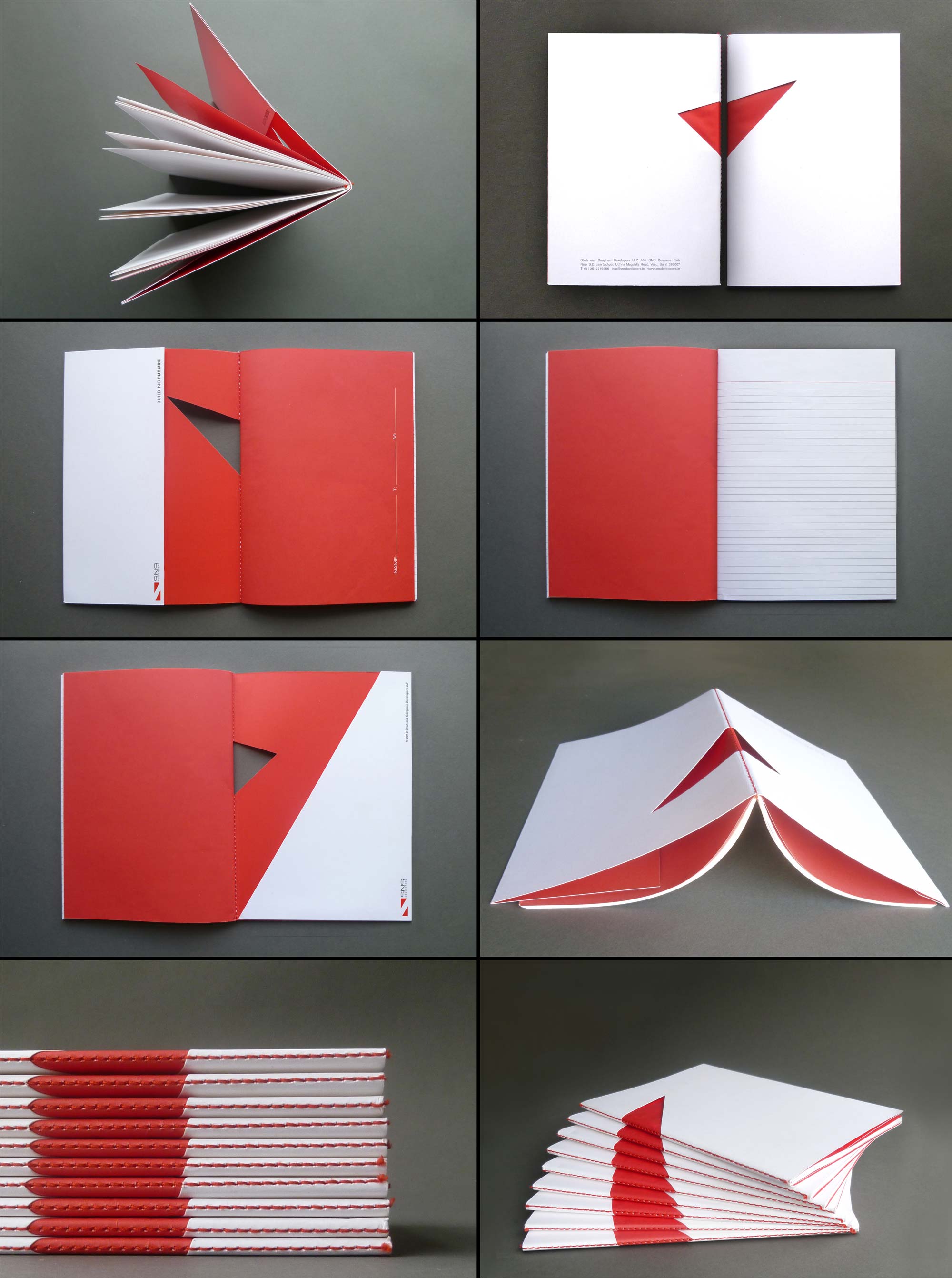
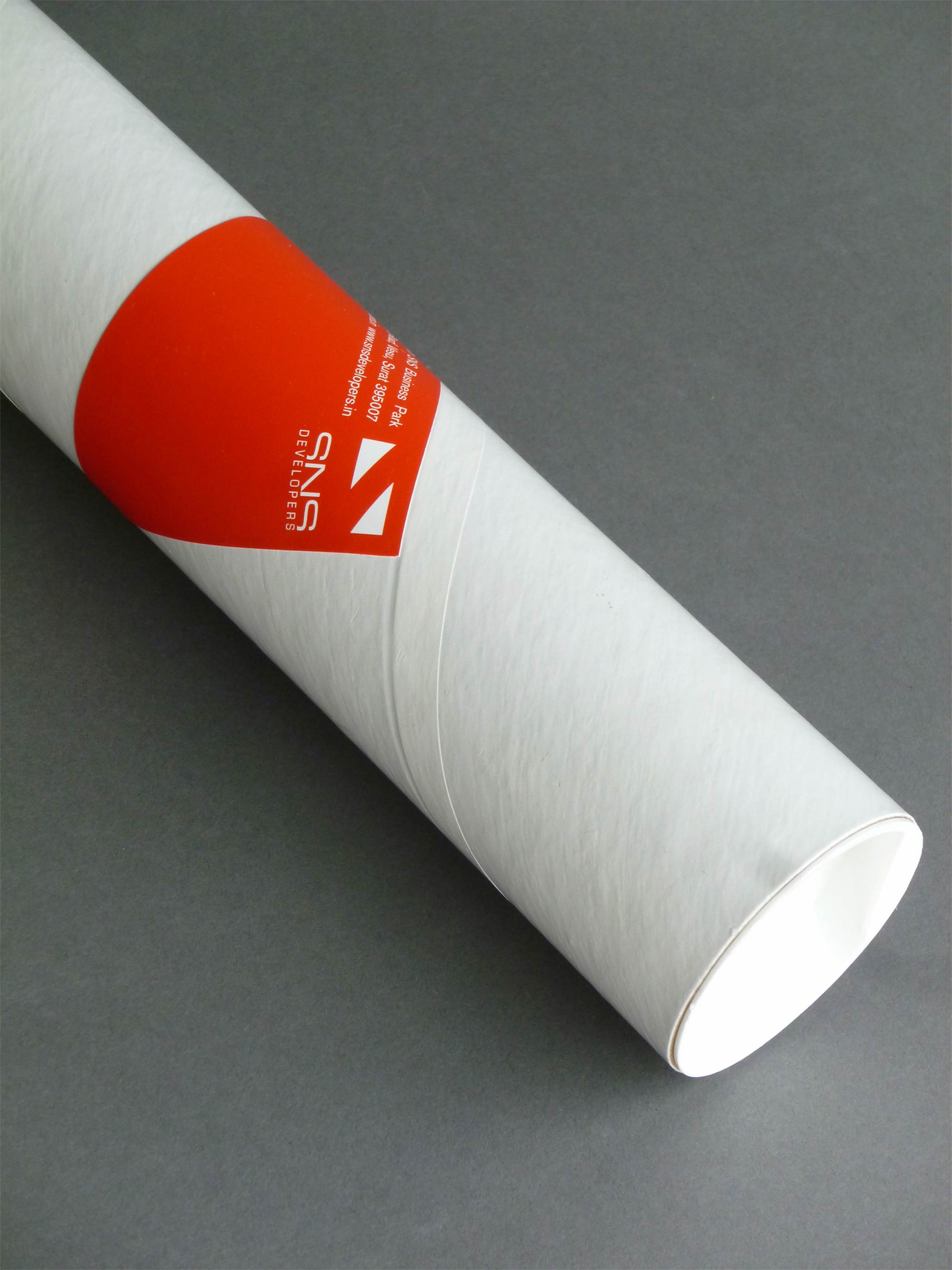
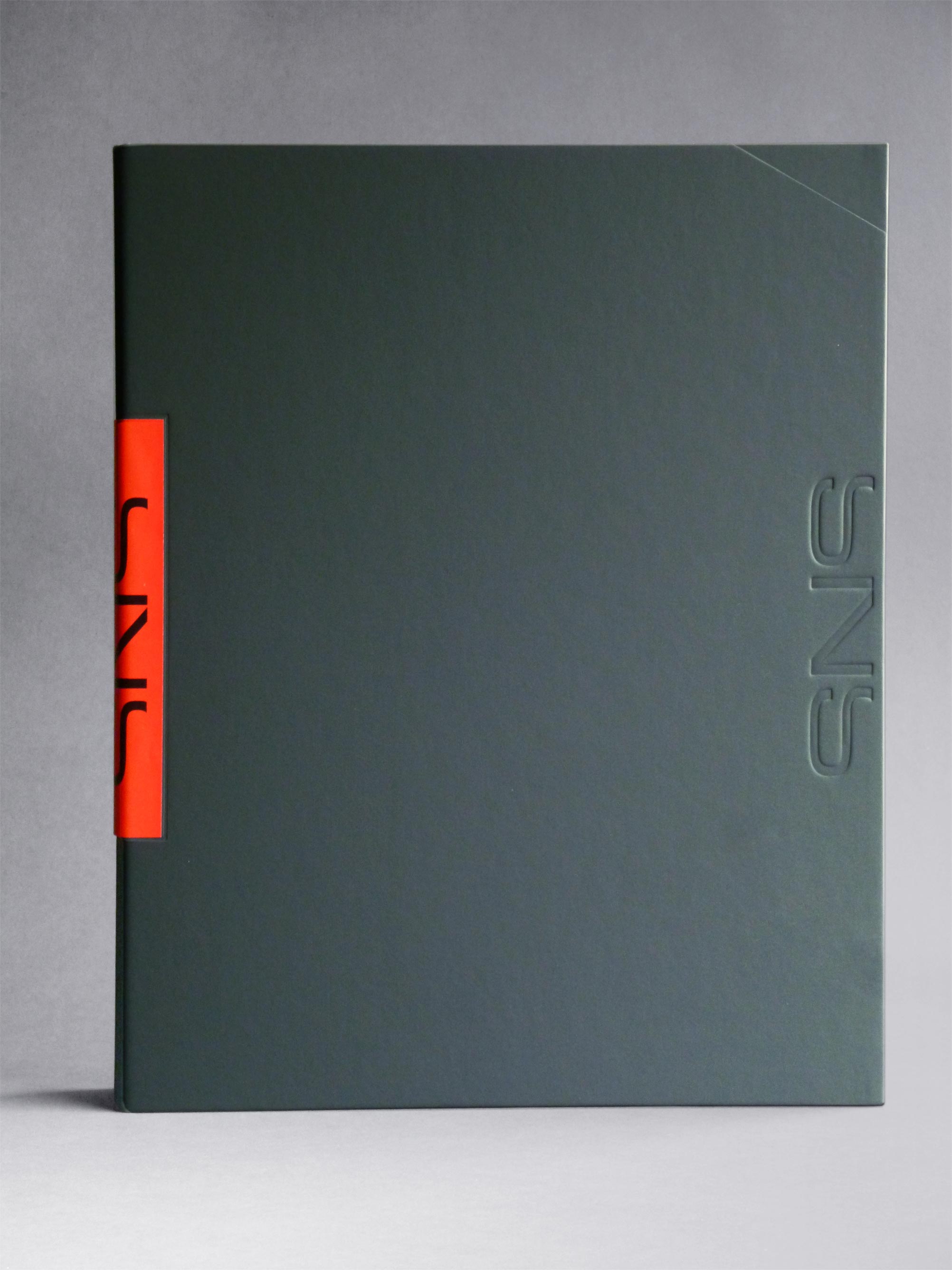
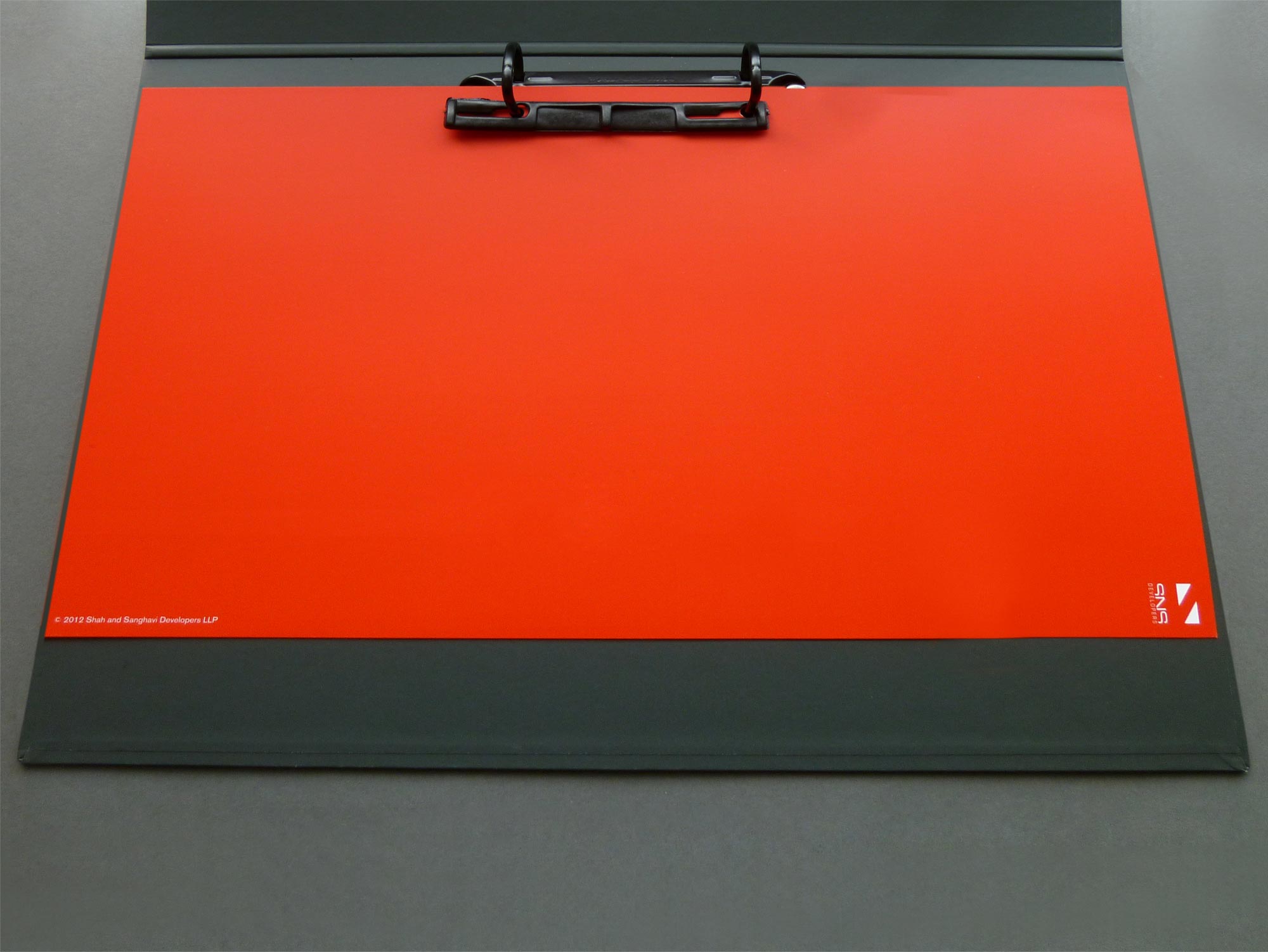
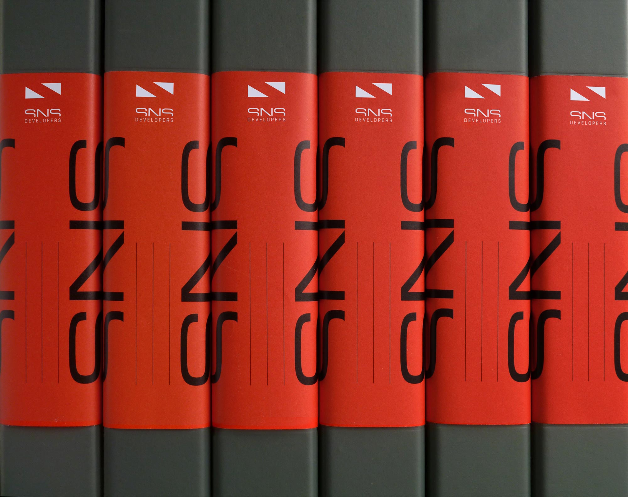
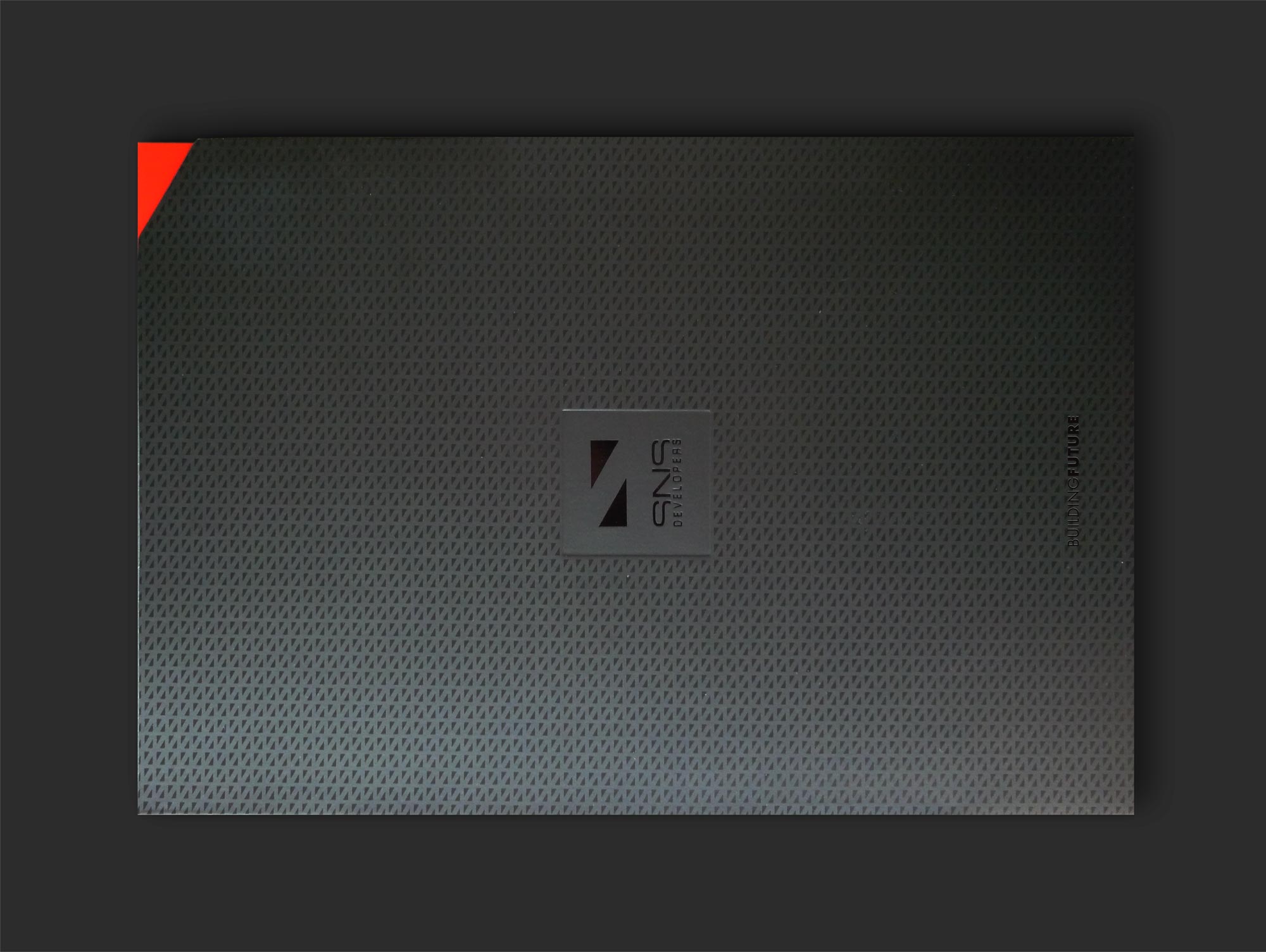
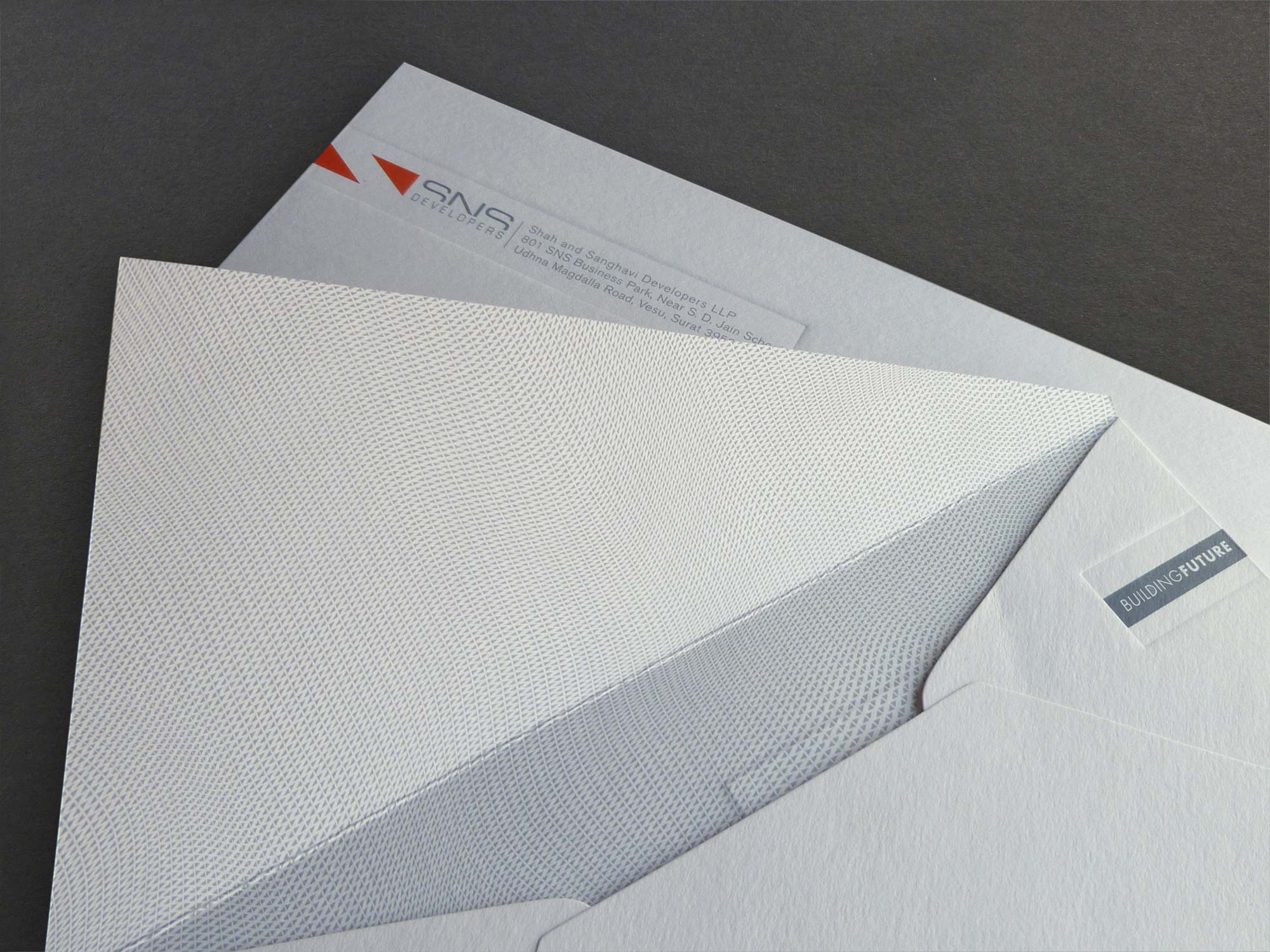
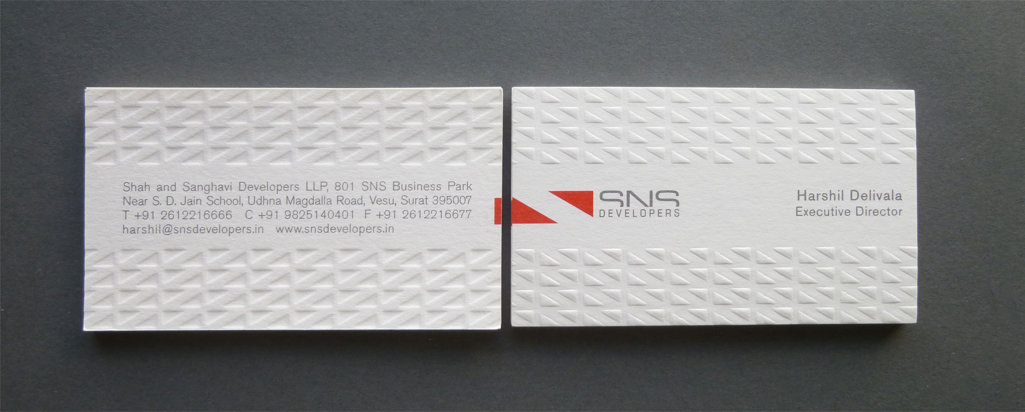
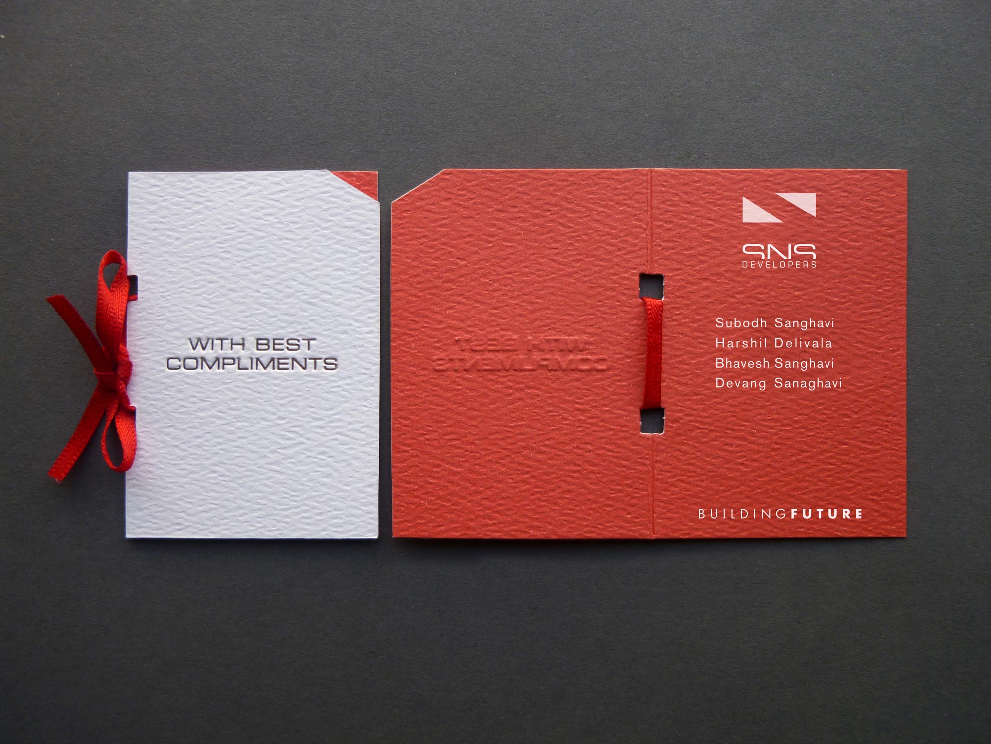
SNS Logo, comprised of two simple red triangles is derived from 3:4:5 triangle (a Pythagorean Triple), typically used in construction industry as a tool or technique for laying out plans, angles and precise squares at large scales. The arrangement of the triangles creates legible space between them through figure-ground (Gestalt principle) forming the letter 'S'. The same, read sideways forms an inverted N.
Credits - Tina Engineer - de.Sign Studio LLC
-
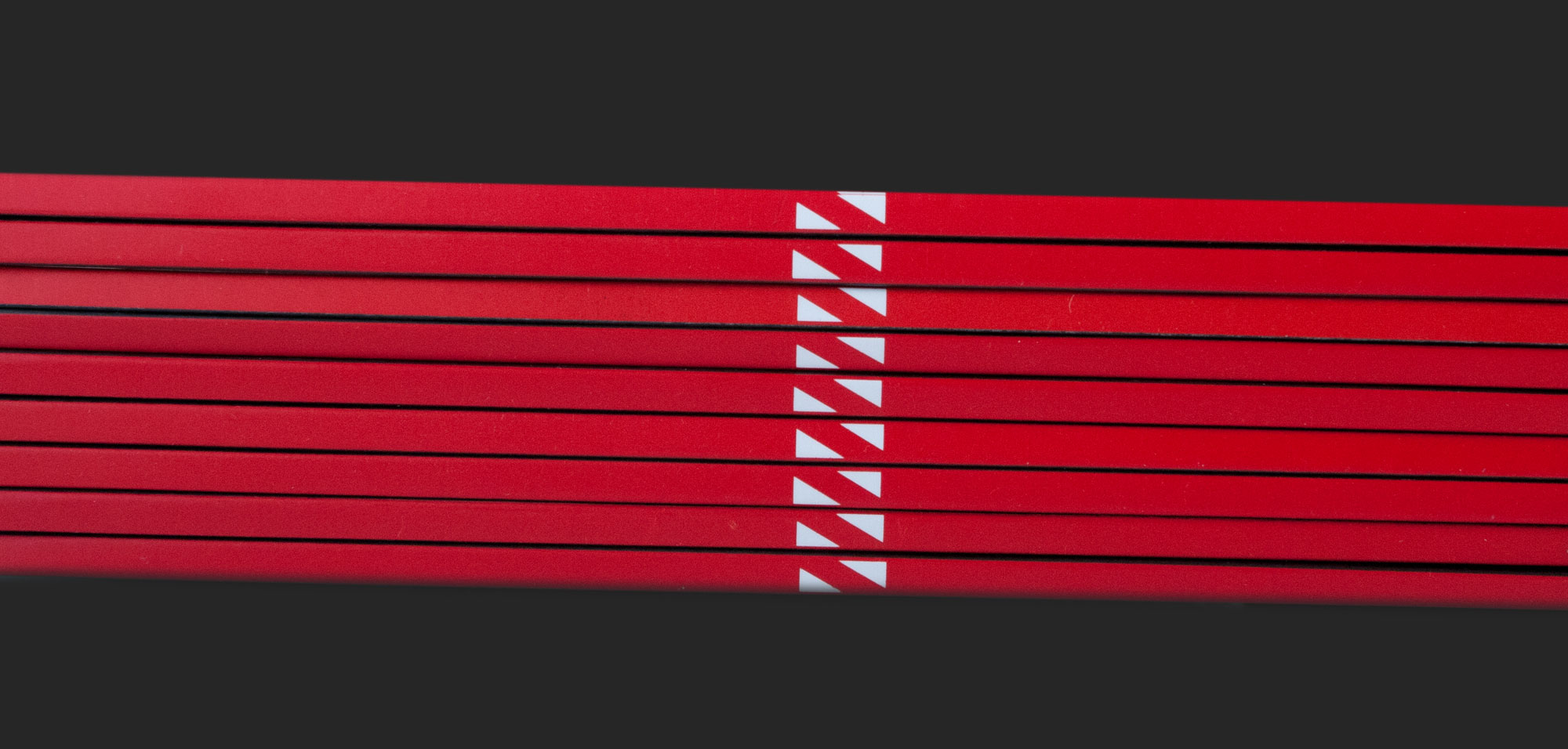
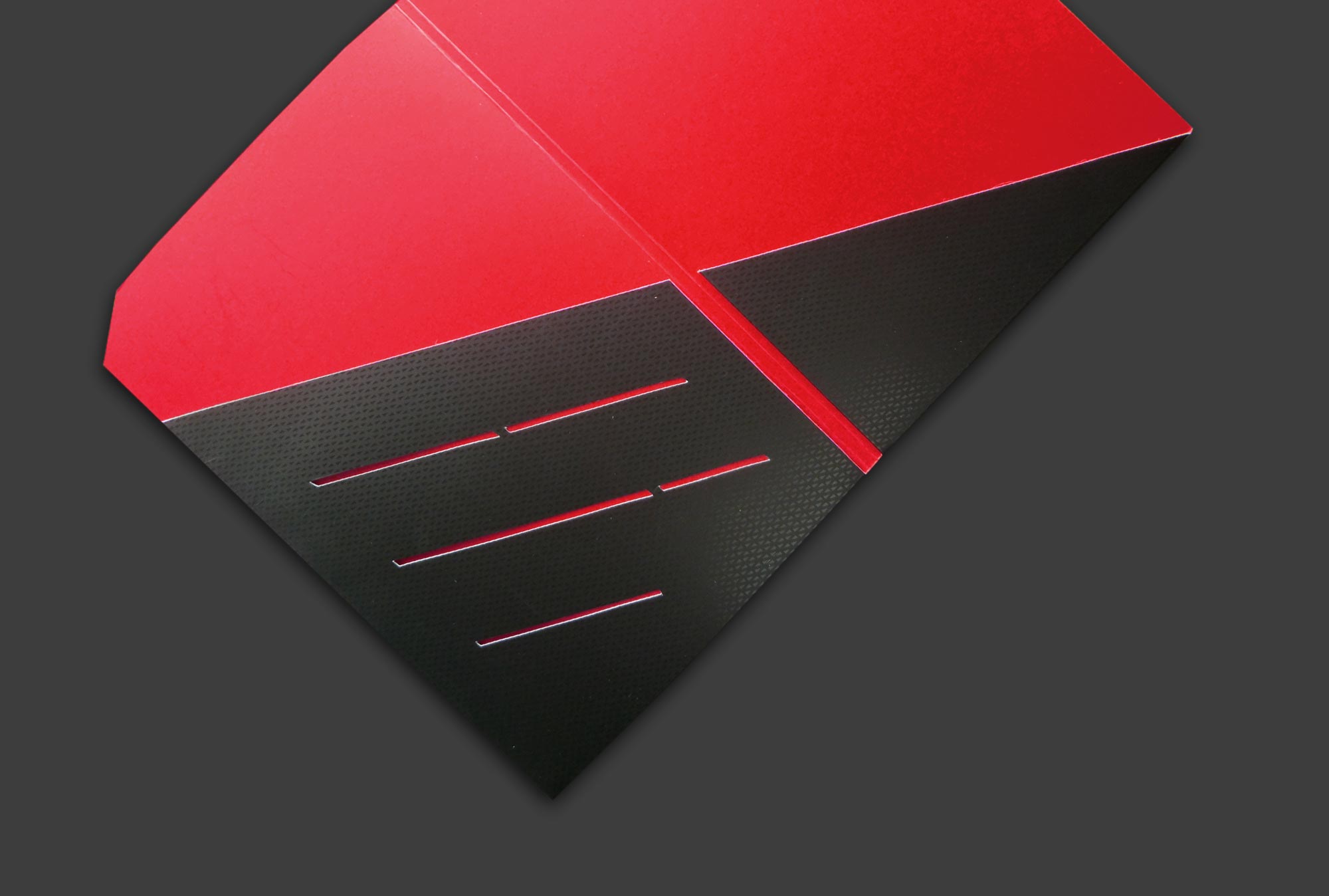
The design not only works at a two-dimensional level where all the pieces work individually, or as part of a set but also on a three-dimensional level: when stacked in various combinations, they take on a form of their own. The logo symbol is applied, adapted and used to create various patterns and forms. It works effectively for branding itself and for extending the brand for other applications such as in the elements of building form(s), facades, and much larger shapes applicable to large-scale architecture and building projects - a core business of SNS Developers LLP.